Website Critiques
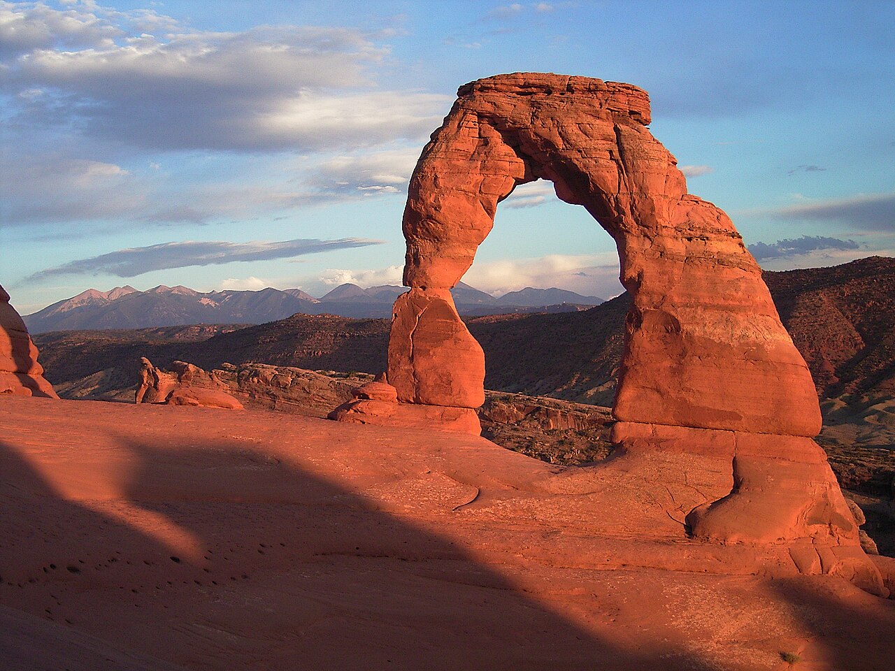
Utah national parks website
Questions:
- What was your first impression of this site?
- How does this site organize the flow of information?Do they have links
on the left and text on the right? Some other scheme? No scheme?
- Does the site structure make sense or does it confuse you? Why?
- Does the site graphics/layout/multimedia enhance the site or detract from
it? Why?
- How long did it take for the home page to load? Was the load time
reasonable?
- Was the text color and size readable? If a background color or
image was used, did it enhance or detract from the site?
- Did the site have a navigation bar or other navigation tool? Was the
navigation well done?
- Did the site have a color scheme or look and feel that was repeated on all
the pages?
- How does the site respond to smaller window sizes (responsive design)?
- What does this site offer that was unusual or very well done?
Answers:
- I thought that the website was nicly organized but it was a little boring.
- The webist has links on the side and has questions at the top it also has lots of links with photos inside that if you press it
transports you.
- At first i was a little confused on it but once I got the hang of it it started to make more sense.
- Yes there is a lot of different things to look at and to click and lots of things to see.
- it took around 5 seconds for it to load so I would say pretty reasonable
- Yes the text color and size were nice the color matched well and the text was big enough for me to see it
- I had a navigation bar at the top of the website and it was easy to use
- It was mainly just a white background but it had some color here and there it it definitely had different things to look at for each page
- Yes the website still looked good when it was smaller and nothing really changed about it other than the text was smaller
- The site had lots of pictures and things to look at the made it a lot more interesting to look at and some of the pictures had links which made it really fun